


I review the key points of this week’s trading, with an emphasis on the trades I executed.
This “Weekly Trade Report” is published every Saturday.
If you read it alongside “Trade Scenarios,” which goes up every Sunday, you can see how I think ahead of time and how I actually execute trades in line with those scenarios.
This is not advice on “how you should trade,” nor am I claiming this is the right answer.
It is not meant to showcase individual wins or losses, nor to recommend specific strategies based on those results.
What I am doing is demonstrating, at an operational level, how I repeat a consistent process grounded in preplanned scenarios, so that you can draw on that “process consistency” when building your own strategy and process.
The outcomes are mine alone and do not guarantee your future profits.
Please keep that firmly in mind, and conduct your own testing and preparation for your own trades, taking full responsibility for your decisions.
I trade pullback buys and sell‑the‑rally setups on the 4h chart.
For my pullback‑buy and sell‑the‑rally strategy, please refer to my earlier posts on Dow Theory and multi‑timeframe analysis.
Now, please take a look at the charts below.
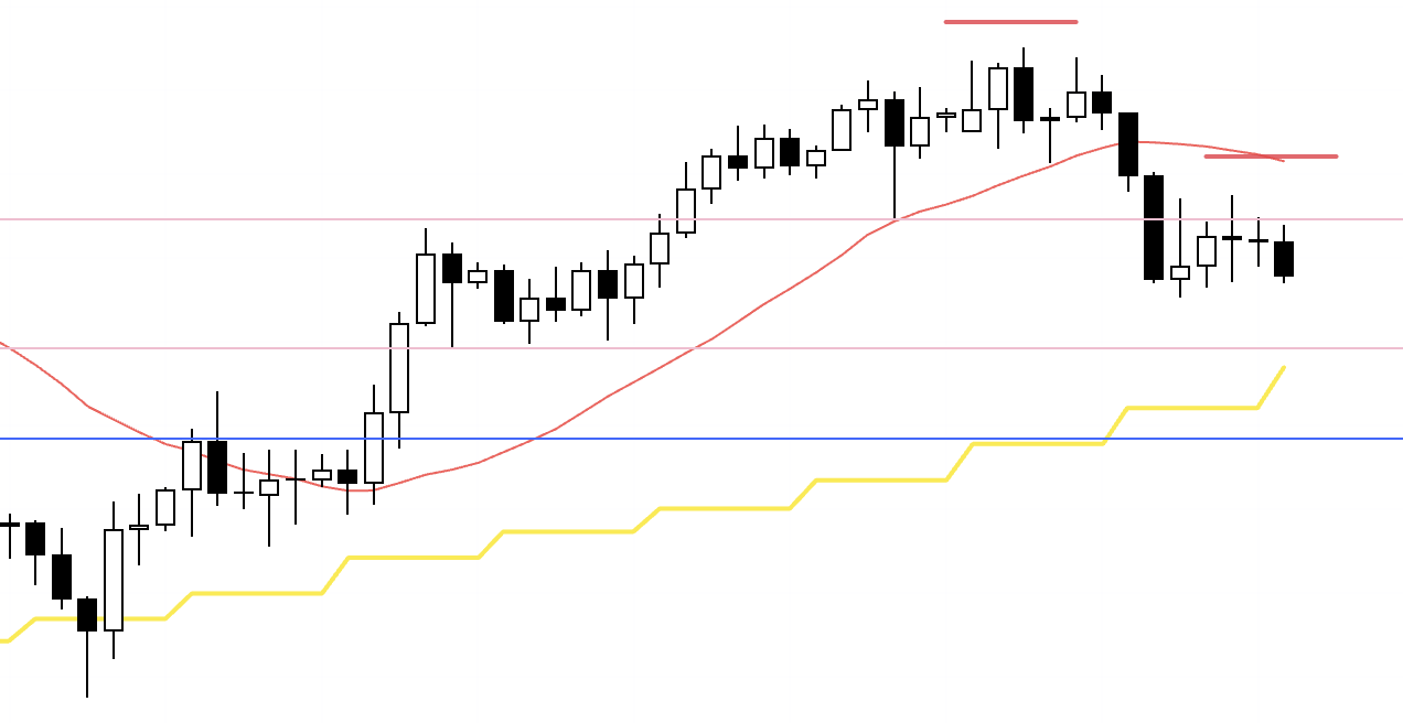
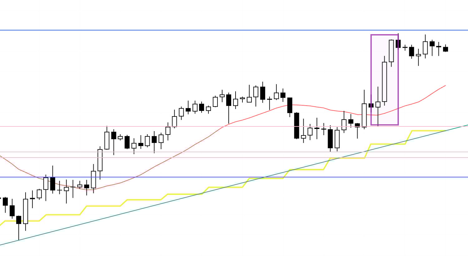
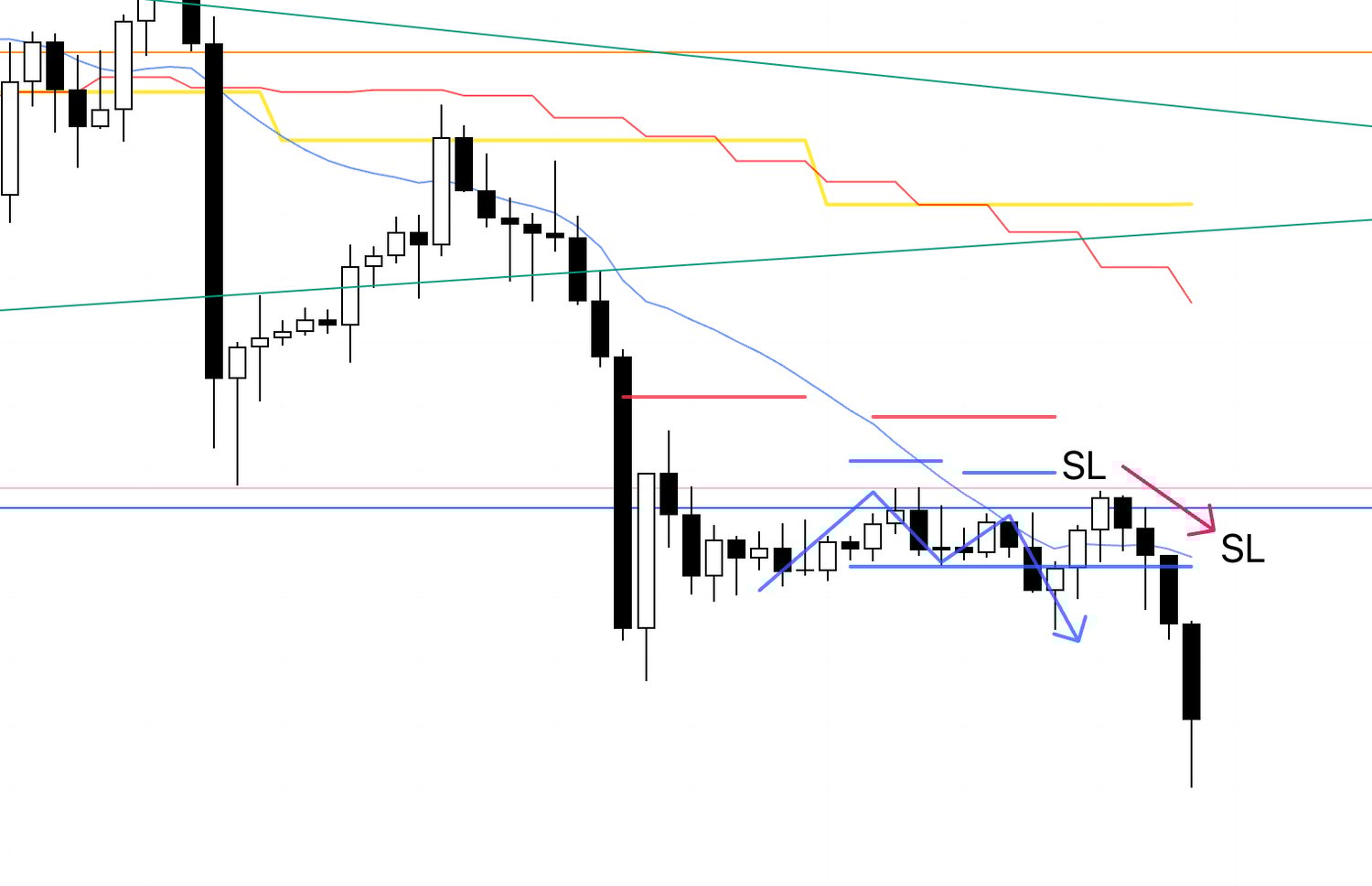
USDJPY 4h

This is the 4h chart of USDJPY.
This week’s movement is to the right of the blue vertical line shown on the chart.
On the 4h, USDJPY printed the short entry I had flagged in last Sunday’s scenario post (the boxed area).
However, as I wrote in the scenario post, this zone attracts daily‑timeframe dip‑buying from below, so the trade required a response that accounted for that.
I will explain this in detail shortly.
Subsequently, as a daily dip‑buy, the 4h flipped from lower highs and lower lows to higher lows and higher highs and trended up.
There were several pullback‑buy opportunities, but with the BOJ policy rate announcement and other events in play, the only USDJPY trade I actually took was the short at the boxed area.
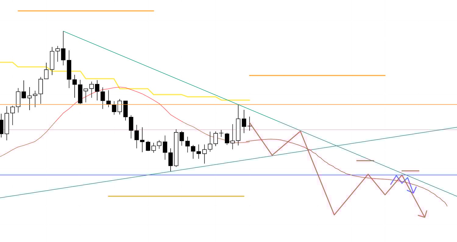
Next, please see the EURUSD chart below.
EURUSD 4h

This is the 4h chart of EURUSD.
EURUSD edged higher early in the week and then continued to fall, making lower highs under the descending trendline drawn from the daily lower‑high area (upper green) and breaking to new lows.
I passed on that first leg down.
As I wrote in Sunday’s scenario post, this region is a weekly dip‑buy area, boxed between the rising trendline drawn from higher‑low points (lower green) and the descending trendline pressing from above (upper green), where daily sell‑the‑rally and weekly dip‑buy flows collide and conflicting intentions tend to cross.
So I planned only to sell “after the break of the lower blue line.”
After price broke below that blue line, the short scenario laid out on Sunday materialized, so I took the trade.
At that point, having broken beneath the weekly dip‑buy area (lower blue line) and then being capped by that line while the 4h formed lower highs, the short side gains a pronounced edge.
I do the same thing every time, but let’s walk through each trade.
〜・〜・〜・〜・〜・〜・〜・〜・〜・〜・〜・〜・〜・〜・
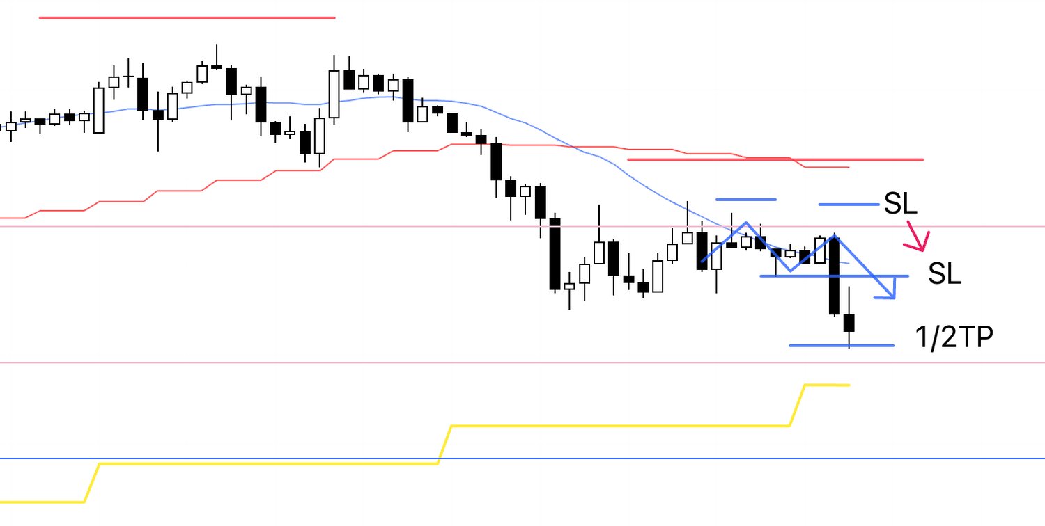
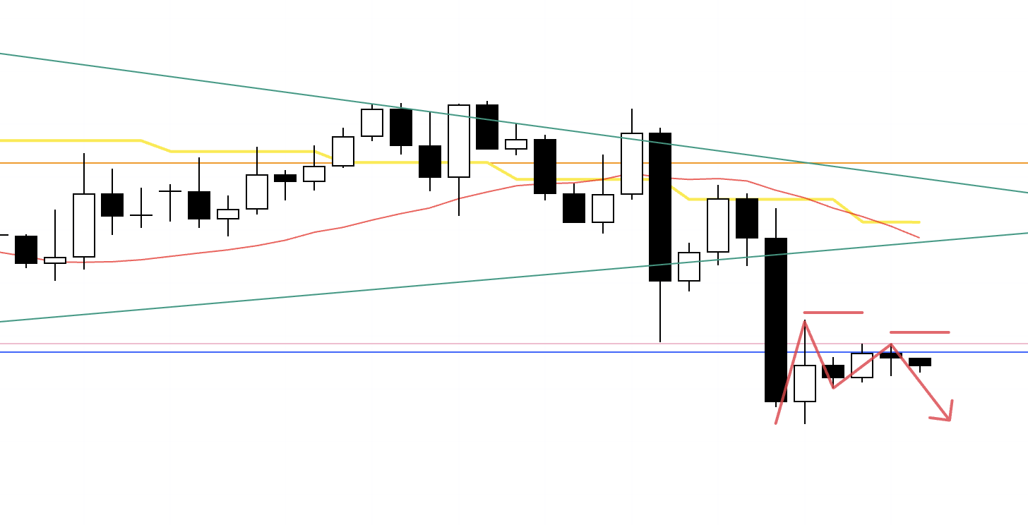
October 29 (Wed)
USDJPY
4h chart from Sunday’s scenario post

This is the short scenario I was watching on Sunday.
Price had slipped below the red moving average that had been supporting it and was now being capped from above, so the idea was to short from the formation of a 4h lower‑high.
In this case, the trend‑follow leg lower would constitute the daily pullback, so the further it fell the stronger the buying pressure would become, which is what last Sunday’s scenario anticipated.
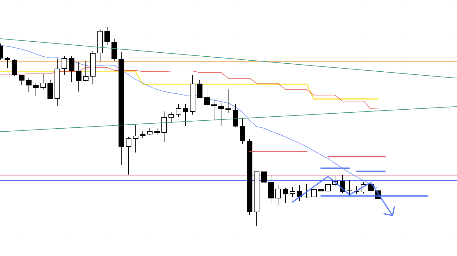
4h
This is the actual 4h chart.
Orders were already placed.
Compared with Sunday’s scenario, the remaining distance to the daily dip‑buy area was short, making the risk‑reward less attractive.
On risk‑reward alone you could justify passing, but price was being cleanly capped by the final swing low of the prior 4h uptrend, so I entered.
This is the first transition point from a 4h uptrend to a downtrend, where profit‑taking sells from prior longs combine with new short orders, creating a spot that can move in one burst and gives the short side an edge.
For traders operating on 4h, a break of that last swing low from the preceding uptrend (the pink line above) is where take‑profits and the stops of those who were long just prior tend to cluster.
Once the longs are flushed and the lower timeframes print lower highs and lower lows under that line, a new downtrend can begin.
As I wrote on Sunday, however, this downswing is the daily “pullback to buy.”
The lower it goes, the stronger the buy pressure from the lower line becomes, so I plan to exit quickly upon arrival at that lower line or on signs of reversal.
It is critical to be constantly thinking about what traders on different timeframes are waiting for and where orders are likely to congregate.
Let’s look at the 1h.
1h

We got a clean rejection at the prior wick low (pink line above) with a lower‑high and lower‑low, so it was a must‑take entry.
As price falls, daily dip‑buyers increase and reversal risk rises, so I planned to secure half the profit just before the lower pink line.
1h
Price reached the vicinity of the pink line quickly, so I took half off.
This is not a market environment for slow‑cooking winners, so I prioritize early profit‑taking.
I pulled the SL down to breakeven.
I will close the balance if the trend breaks.
1h
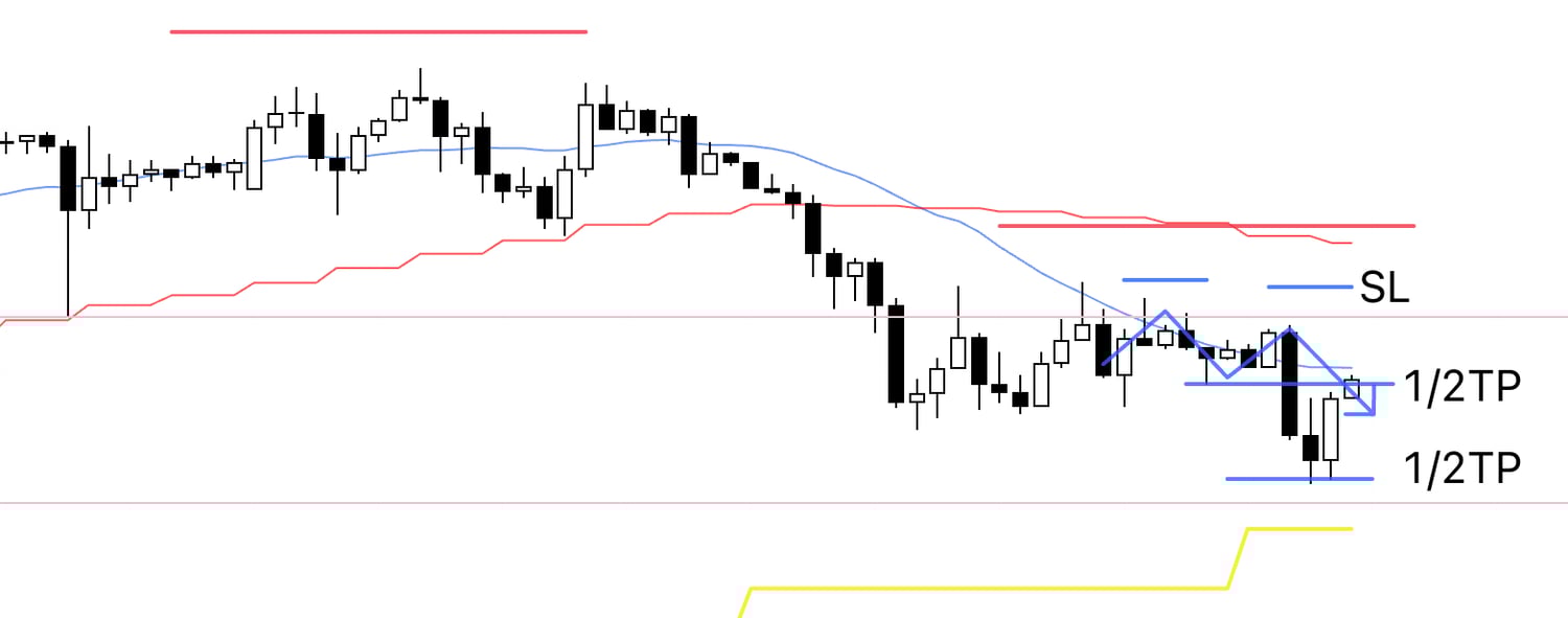
The trailing stop I had tightened was hit, and that trade concluded.
〜・〜・〜・〜・〜・〜・〜・〜・〜・〜・〜・〜・〜・〜・
After That
4h Chart from Sunday's Scenario Blog
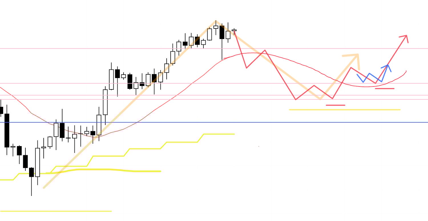
In Sunday's scenario blog, I had outlined a scenario where the 4h would reverse its trend at this previous low line (the pink one below), with fresh buying entering as a dip buy on the daily chart, leading to an upward move via 4h pullback buying.
4h
In terms of actual price action, such a phase did materialize, though overlapping events prevented me from taking the trade this time.
What matters is maintaining a multi-timeframe perspective on the market while always thinking one step ahead and staying prepared.
〜・〜・〜・〜・〜・〜・〜・〜・〜・〜・〜・〜・〜・〜・
October 31 (Fri)
EURUSD
4h chart from Sunday’s scenario post
This is the short scenario I was watching last Sunday.
The plan was to sell on the lower timeframes after a break of the lower support line (blue), with that support flipping to resistance and the 4h forming a lower‑high under it.
This area negates the weekly dip‑buy, clears out the buy side, and delivers strong short‑side edge.
4h
This is the actual 4h chart.
Support broke, and the 4h formed a lower‑high while being capped by the former support.
I had initially drawn the blue line, but the line that actually capped price was the slightly higher pink line.
That pink line can be drawn from the most recent swing low and the one before that, so if price is capped and reverses from there, it creates powerful short‑side edge.
1h
Here is the 1h view.
I entered on a break of the 1h low.
The SL is just above the capping pink line.
1h
We got a sharp pullback once, but price ultimately could not clear the pink line and rolled over again.
With the moving average having dropped to breakeven, I pulled the SL down to breakeven.
By the way, it is Friday, and I do not hold positions over the weekend.
Depending on the time remaining, I will either take profits at a clean round handle, close on a trend break on a lower timeframe than 1h, or close manually before the market shuts.
1h
With little time left, I lowered the SL and banked half at the prior low.
From here, either we break the low and extend, fail to break and form a double bottom and reverse, or do neither and run out of time and close everything.
1h

Time was short, so I lowered the SL further.
This aligns with the point where the 15m trend would break.
Let’s also check the 15m.
15m

On the 15m, this is the relevant spot.
I will close the remaining position on a 15m trend break, or close manually if it does not break within the session.
1h
The 15m trend broke, so the trade concluded here.
I have written about similar Friday trades before, and as I said then, I do not carry positions over the weekend, so that dictated this exit.
In routine trading, there would be no reason to exit at this point, and I would keep the position until the 1h trend breaks.
Noted for clarity.
〜・〜・〜・〜・〜・〜・〜・〜・〜・〜・〜・〜・〜・〜・
That is all.
I never place trades on a whim, and simply repeat “if this, then that” in line with the preplanned scenario.
Because the scenario is prepared beforehand, I know where the edge is and where the risk is, and I can act accordingly.
In the USDJPY trade this time, knowing in advance that daily dip‑buying would step in around that area allowed me to take half profits early at the line and to exit quickly.
This was already clear at the time of last Sunday’s scenario and was not improvised.
Of course, after banking half, price could have broken lower.
This is not about predicting the future but about continually wagering on probabilities.
That is why I see value in first publishing the scenario—what I read from an uncertain chart and how I prepare—then showing the consistent execution that follows.
Without first laying out the scenario, merely saying “I took this trade” invites after‑the‑fact interpretation and teaches nothing, and risks devolving into simple winner’s bragging, which I consider harmful.
My trading is simple and repetitive, but it adheres to market first principles and does not go out of style.
Charts do not lie.
Behind every chart are traders actually buying and selling, and real orders.
And because the trades that formed the chart must eventually be unwound for traders to realize P&L, it is crucial to identify where those orders concentrate across timeframes and trade only at those concentration points.
So long as I read the market across multiple timeframes, manage risk, and trend‑follow in alignment with the higher timeframe, for me personally, compounding avoidable losses to the point of ruin is not something I can envision.
Of course, short-term results are influenced by randomness, so losing streaks occur with any strategy.
However, I enter with small stop distances on the lower timeframes at points that have high hit rates and tend to run significantly on the higher timeframes, so even during a streak of losses, risk is always capped at a specific percentage, and the more this is repeated over the long run, the more easily capital tends to grow.
It may sound easy when you read it, but drilling this simple approach until it is ingrained is not easy.
If you do not yet have a strategy or do not understand how to read charts, rather than chasing complex methods, I recommend mastering Dow Theory—the fundamentals of trend—and training yourself to see the market across multiple timeframes first.
Looking at highs and lows is basic, but what matters is how far you hone that basic to a level you can actually trade.
My trading is always anchored to previously formed swing highs and swing lows.
No one knows the future, but swing highs and lows are obvious to all and do not change after the fact.
Because they are obvious, orders tend to cluster there, and the more those levels align across multiple timeframes, the stronger the statistical edge.
In any case, master the basics, test thoroughly, practice repeatedly, and invest time in preparation.
I hope this blog offers clues to those building a strategy or struggling to achieve consistency.