

I will review key trading takeaways with a focus on the trades I executed this week.
I post this Weekly Trade Report every Saturday.
If you read it in tandem with Trade Scenarios, which I publish every Sunday, I believe it will help you see how I frame the market in advance and how I execute trades based on those scenarios in real time.
This is not advice on “how you should trade,” nor am I claiming this is the right answer.
It is not an attempt to showcase individual wins and losses, nor to recommend any particular strategy based on those results.
Its purpose is to demonstrate, at an operational level, how I repeat a consistent process grounded in prebuilt scenarios, so that you can use it as a reference for building your own strategy and enforcing process consistency.
The results are solely my own and do not guarantee your future profits.
Please keep that firmly in mind, and make sure you conduct your own testing and preparation, and take full responsibility for your own trading.
I trade 4h pullback buys and rally sells.
For my pullback‑buy and rally‑sell methodology, please refer to my prior blog posts on Dow Theory and multi‑timeframe analysis.
Now, please take a look at the charts below.
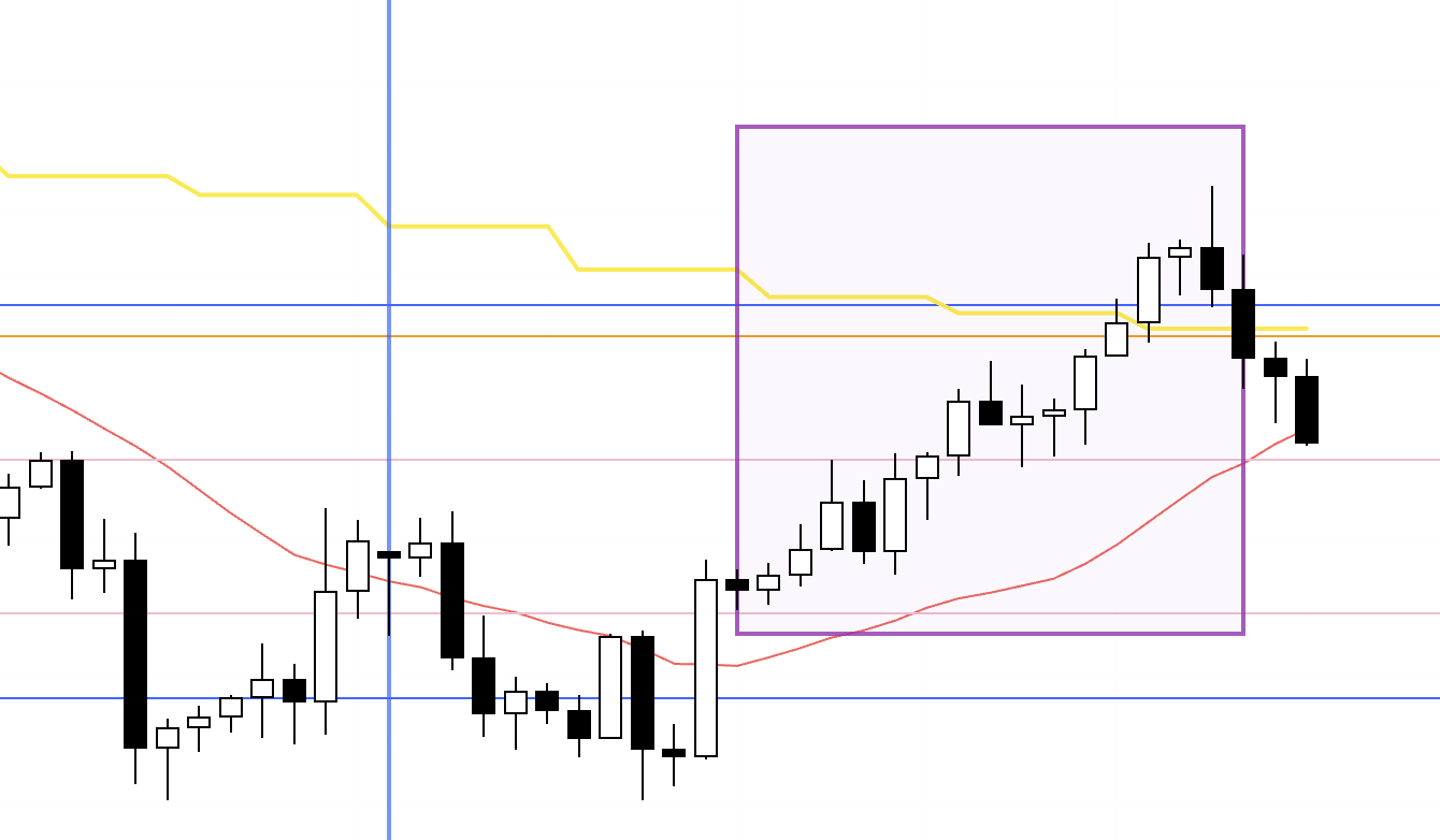
USDJPY 4h
This is the USDJPY 4h chart.
This week’s price action is the portion to the right of the blue vertical line on the chart.
On the 4h, USDJPY continued to print lower highs and break prior lows, retracing to close the gap with the daily moving average, effectively marking a liquidation of prior longs.
The boxed area shows price neatly capped by a resistance line, creating a structure I would normally want to trade, but I was mindful of the blue line drawn below it, so the risk‑reward from the entry did not meet my criteria and I did not take the trade.
In hindsight, price did sell off cleanly, but it was not a trade for me.
That said, it is a very clean formation, and if there were no nearby support lines, it would be a pattern I would look to trade aggressively.
Next, please see the EURUSD chart below.
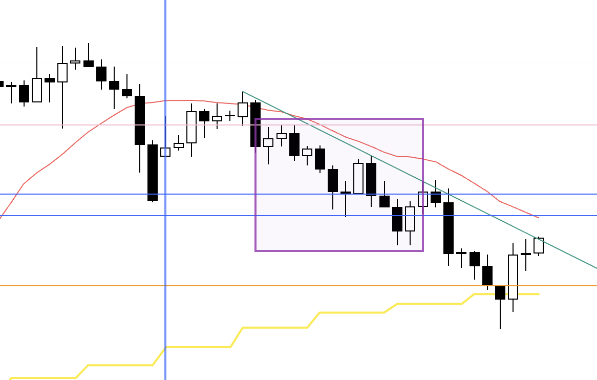
EURUSD 4h

This is the EURUSD 4h chart.
The long scenario I laid out on Sunday materialized, so I traded the boxed section.
I captured screenshots and commentary during the trade, which I will introduce below.
〜・〜・〜・〜・〜・〜・〜・〜・〜・〜・〜・〜・〜・〜・
Wednesday, October 15
EURUSD
4h chart from Sunday’s scenario post.
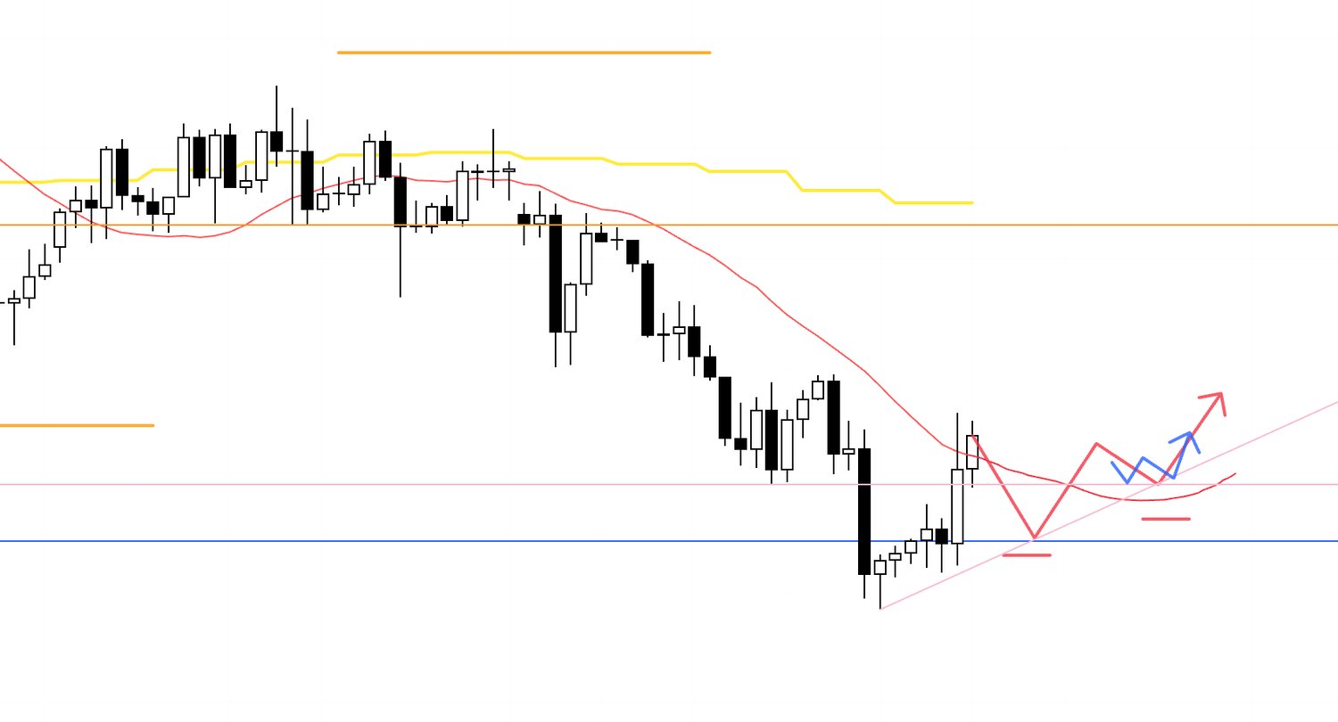
In Sunday’s scenario post, I laid out a long setup at the point where 4h price holds above the pink line that initiated the prior 4h lower low, fails to break below the blue line drawn beneath the chart, and is supported from below by the moving average (red).
When that exact picture emerged, I went long.
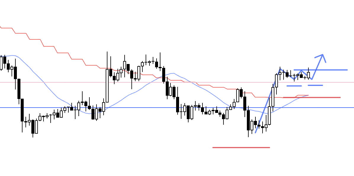
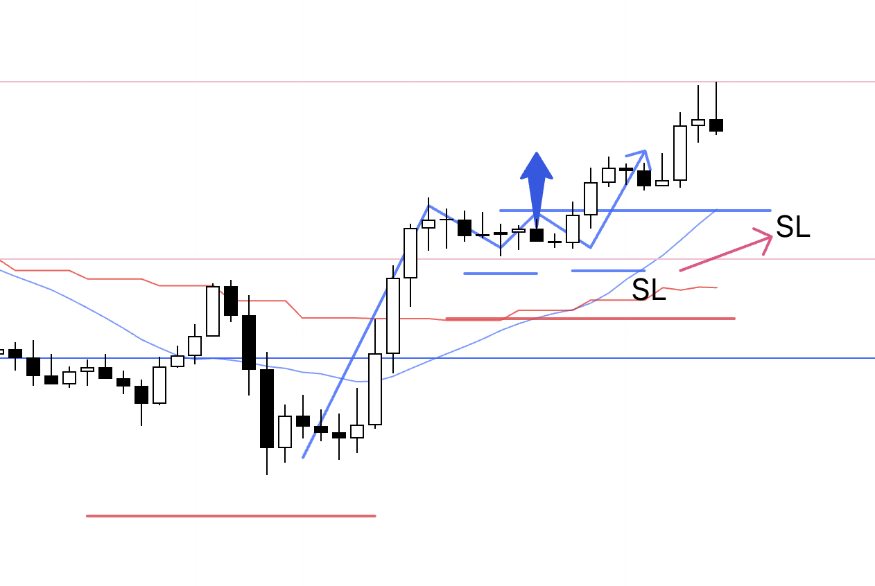
4h

This is the live 4h chart at the time.
With the 4h putting in a higher low and creating the entry point, I entered.
I placed the order right after checking the chart in the morning, so I did not have time to write this blog post beforehand, and the image here is from just after entry.
1h
This is the 1h chart.
As usual, I entered at the 1h higher‑low and higher‑high point nested within the 4h higher‑low structure.
On the 1h, that move terminated the prior downtrend, and this higher‑low and higher‑high became the starting point of a new uptrend.
The break of that high also confirmed the 4h higher low and thus the 4h trend reversal to the upside, making it a must‑take entry for me.
As outlined in Sunday’s scenario, price failed to break below the blue line and reversed into an uptrend, which makes the long edge particularly strong here.
1h
I moved the stop loss to just below breakeven.
1h
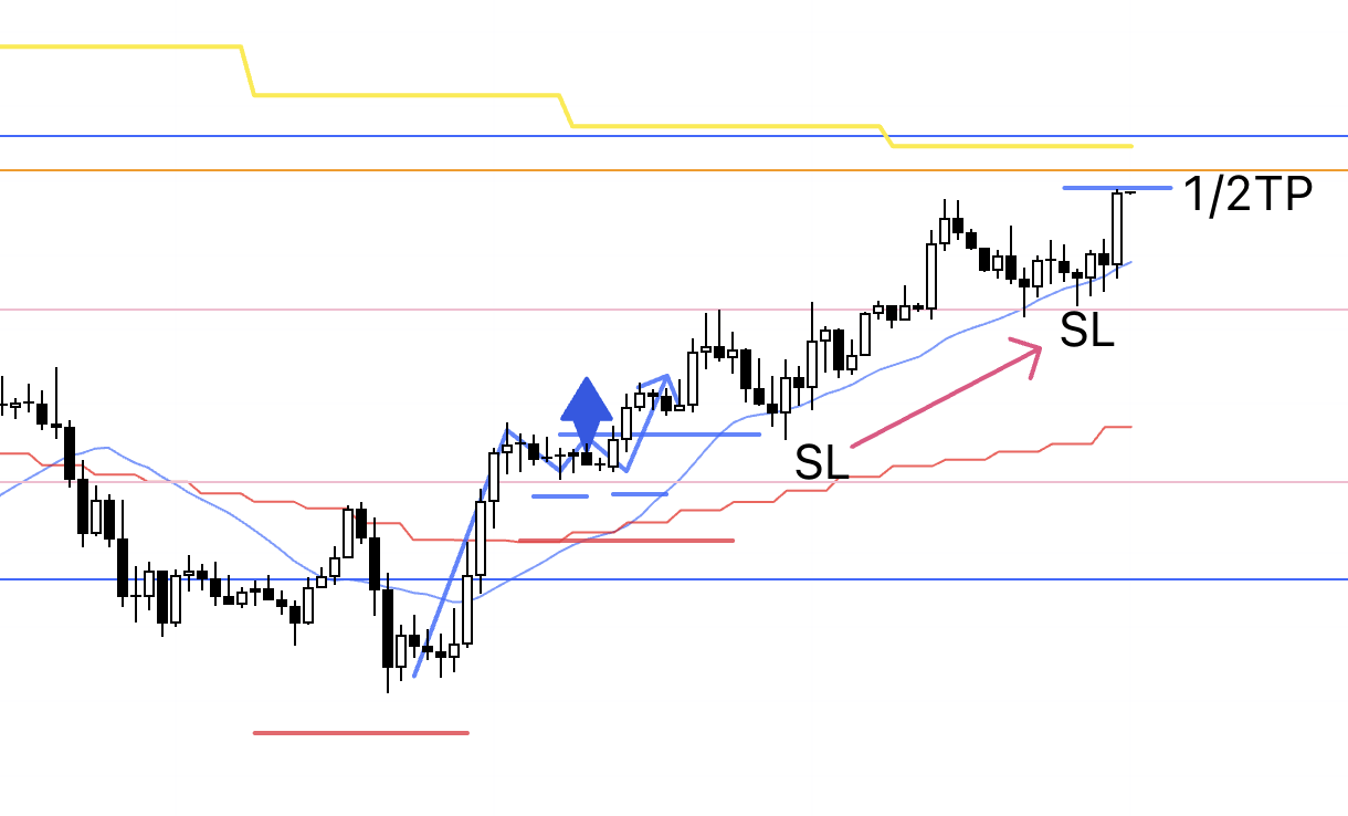
As mentioned in Sunday’s scenario post, this advance is a rally within the broader daily downtrend, likely forming a swing high for a subsequent sell‑the‑rally on the daily.
Price was approaching the daily moving average (yellow), and there was also a resistance line (orange) visible on the daily, so I took partial profits ahead of that area.
To show exactly where that line is drawn from, I captured a zoomed‑out chart below.
1h
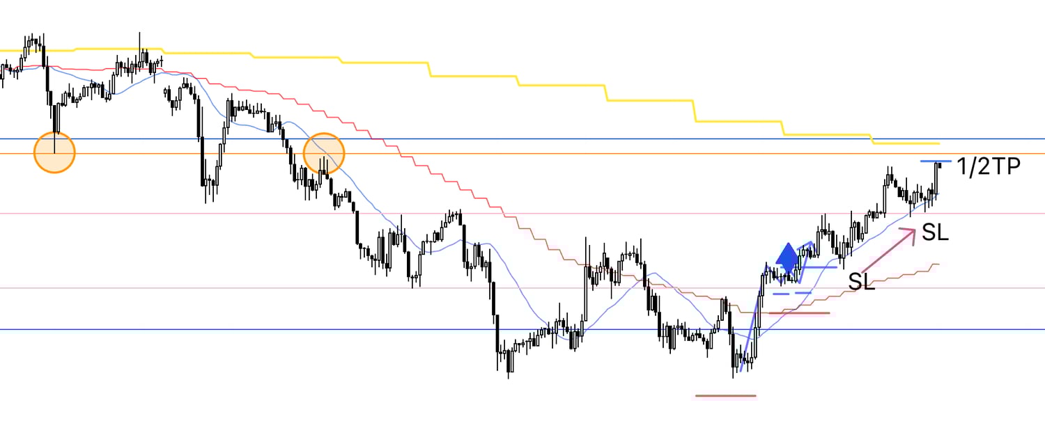
This orange line is drawn from the prior low and high indicated by the circles on the chart.
It is a level visible even on the daily, and because it coincides with the daily moving average (yellow), the probability of increased daily sell‑the‑rally pressure rises there.
I therefore secured half the profits just in front of this line.
1h

Price pushed through the orange line, then put in a higher low and broke to new highs, so I trailed the stop higher.
1h
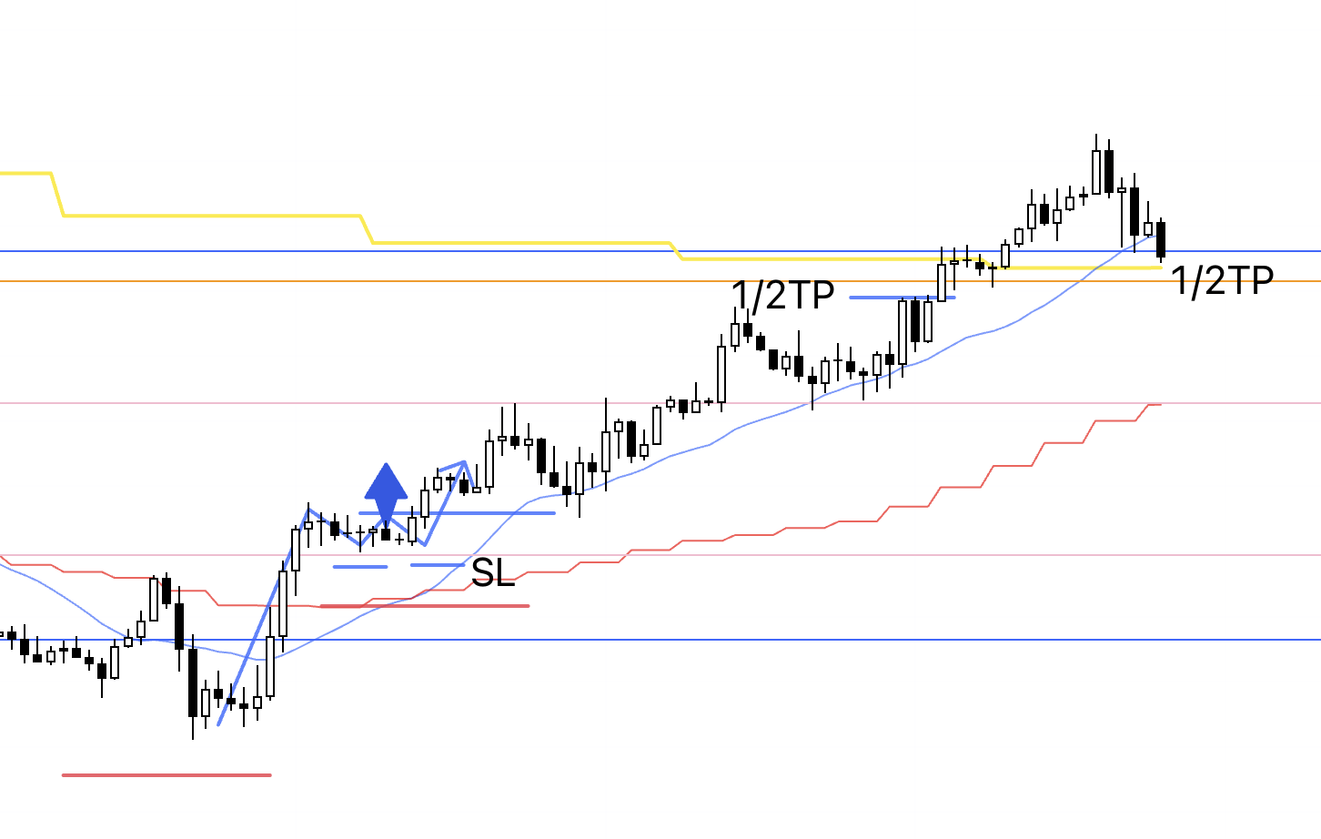
When I looked to trail the stop, price had undercut lows in a way that compromised the trend and broke below the blue line I had drawn, so I manually closed the remaining position and ended the trade.
〜・〜・〜・〜・〜・〜・〜・〜・〜・〜・〜・〜・〜・〜・
That is all.
Each time it is essentially the same trade with the same explanation, which may not make for a particularly entertaining read, but the trader’s job is precisely this unexciting repetition.
The locations on a chart where edge appears are limited.
Avoid unnecessary trades that create losses, execute only the necessary trades, and accept losses only there.
That discipline is critical to producing profits in aggregate.
I always build scenarios in advance and only trade in line with those scenarios.
Because I understand in advance where the risks lie and under what conditions a long edge emerges, I can exclude all other trades.
Even if that reduces trade frequency, what matters is taking only what is necessary and what should be taken.
I also always prioritize the higher‑timeframe context and strictly enter the higher‑timeframe pullback using the initial impulse on the lower timeframe.
This allows me to target higher‑timeframe extension using the lower‑timeframe stop size, improving both win rate and risk‑reward.
People often say “win rate and risk‑reward are a trade‑off,” but that is not necessarily true when you have edge.
With robust multi‑timeframe analysis, you can trade points where the higher‑timeframe edge emerges while entering from the very start of the lower‑timeframe trend, effectively “using the lower‑timeframe stop size” to ride into the higher‑timeframe move, which is highly advantageous.
In trading, “earning profits” is the final stage.
First, translate your understanding of the market and supply‑demand into the actual chart, construct a strategy, test it over a large sample, and then train yourself to execute your strategy with consistent behavior.
Those steps matter.
Through this blog I walk through scenario construction and execution every week.
It may read as simple, but please understand that this simple repetition is extremely hard, and resist the temptation to skip the necessary steps.
I hope this conveys the importance of consistent scenario building and execution, and that it offers something useful for your own process.